Logo and Mascot
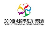
Logo
The design concept of the flora exposition’s logo and mascot are based on internationalization, modernisation, liveliness and accessibility as main elements. These elements correspond to the theme of Taipei International Flora Exposition “Flower, River and New Horizon”.
The Expo mascots are comprised of five flora figures, each symbolizing a different flower. Integrating the elements of traditional sleeve dance and figurative of Taiwan’s pride, the orchid flower creates body rhythms outlined by the flower’s carpel, stamen and petal, signifying the flow of a running stream in accordance with the theme of Taipei International Flora Exposition ‘Flower, River and New Horizon”.
The five different colours red, orange, blue, green and purple represent the five different continents, not only symbolizing internationalization and modernization, but these cheerfully bright colours also generate an atmosphere full of joy and happiness, thus outlining the delight and pride of Taipei City Government’s National first international flora exposition.
Mascot

The concept behind the design of these Expo mascots is gathered from the spirits of Mother Nature, forming a band that represents the harmonious chapter of the four seasons; spring, summer, fall, and winter.
The colourful and decorative clothing of the Expo mascots signifies the harmony, enjoyment, joy and passion about the 2010 Taipei International Flora Exposition. Their approachable smiles lead the spring, summer, fall and winter flora spirits together to perform a symphony of remarkableness.
As the grand opening of the exposition draw closer, this mascot band of the nature and passion brings forth the joy and happiness of the flora expo to every corner of the world.
Introduction to the designer of these award winning mascots
Designer: An-Kai Lee
Current Position: DOPLAN Business management and Solution Consultant Creative Design
Achievements:
02’ 2002 dpi Magazine National Creativity Design Award – Gold medallist
02’ Chunghwa Telecome HiNet ADSL Broadband Advertisement Award – First Place
06’ Keelung City Fire Department Mascot Design Award – Second Place
Design inspiration of the seed mascot
It all starts from a little seed bearing the strength and meaning of “Hope”. As it grows stronger, bigger and finally sprouts, the world is blessed and purified with beauty. The seed mascot signifies all plants and can be decorated with different cultural symbols and national flowers representing different countries. This design is not only flexible in its operation but also appropriate in terms of its significance.